More Than Recipes: How Design Tools Quietly Transformed My Daily Eating Habits
Ever feel like healthy eating slips through your fingers by Wednesday? I did—until I started using simple creative tools I already had. No strict apps or diet trackers, just intuitive design features that helped me visualize meals, plan with joy, and actually stick to better choices. It wasn’t about willpower; it was about making small, smart changes feel effortless. This is how technology quietly became my ally in building a calmer, clearer relationship with food. What began as a frustrated attempt to stop staring into the fridge with zero ideas turned into a gentle, creative habit that reshaped not just what I eat, but how I move through my day. And the best part? None of it felt like work.
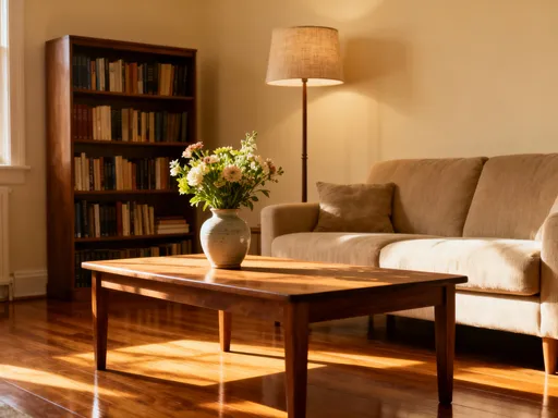
The Moment I Realized My Kitchen Needed a Redesign
There was a time when opening the fridge felt like stepping into a puzzle with missing pieces. I’d stand there, hand on the door, staring at containers of leftovers, half-used vegetables, and a sad-looking lemon from last week. I wasn’t lazy—I cared about eating well. But decision fatigue hit hard by midweek. After a long day of managing schedules, answering emails, and keeping the household running, the last thing I wanted was to figure out dinner from scratch. So I’d default to takeout, or toast with cheese, or worse—snacking mindlessly until I wasn’t even sure what I’d eaten.
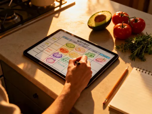
I tried recipe apps. I downloaded a few meal planners. But most felt rigid, like they were scolding me for not being organized enough. They asked for calorie goals, macronutrients, shopping lists with checkboxes that never got checked. I didn’t need another to-do list. I needed clarity. What finally clicked wasn’t a new app—it was a shift in mindset. I remembered how much I used to love doodling in notebooks, arranging little sketches just for fun. So one Sunday, instead of writing a grocery list, I opened a blank digital canvas on my tablet—something simple, like a whiteboard tool I already used for work brainstorming—and started playing.
I drew a simple grid for the week. I didn’t write meal names. Instead, I used colors. Green for plant-based dinners, yellow for comfort food nights, blue for quick meals. I added little icons: a steaming pot for soups, a sun for light lunches, a heart for meals I knew my family would love. I wasn’t following a system. I was creating a mood board for my week. And something surprising happened. I looked at that grid and felt calm. It wasn’t perfect. It didn’t promise to fix everything. But it gave me a sense of direction. For the first time in months, I actually looked forward to planning dinner.
This wasn’t about discipline. It was about design. By turning meal planning into a visual, creative act, I removed the pressure. I stopped asking, "What should I eat?" and started wondering, "How do I want to feel this week?" That shift—small as it seemed—was the beginning of a real change. The fridge didn’t change. The ingredients didn’t magically multiply. But my relationship with them did.
From Chaos to Calm: Turning Meal Planning into a Creative Ritual
Meal planning used to be the last thing on my Sunday checklist, right after laundry and before collapsing on the couch. It felt like a chore, something I did out of guilt or obligation. But once I started using design tools to make it playful, everything changed. I began treating it like a weekly creative date with myself. Every Sunday morning, after the kids left for their activities, I’d pour a cup of tea, open my favorite digital workspace, and clear the screen. No pressure. No rules. Just space.
I started with sticky notes—digital ones, color-coded and easy to drag around. Red for proteins, green for veggies, purple for grains. I’d browse food photos online—not to copy recipes, but to gather inspiration. A photo of a roasted sweet potato bowl with tahini drizzle might catch my eye, and I’d save it to a folder called "Fall Vibes." Then I’d drag a purple sticky note into Wednesday’s slot and write "grain bowl night" with a little sun emoji. It wasn’t formal. It was intuitive. And because it felt like play, I looked forward to it.
Sometimes I’d create a mini mood board for the week. I’d include not just food ideas, but words: "cozy," "light," "energized," "nourished." I’d pair those with images—a warm soup, a crisp salad, a slice of whole-grain bread with avocado. Seeing those visuals together helped me tune into how I wanted to feel, not just what I wanted to eat. And when Wednesday rolled around and I was tired, I didn’t have to think. I just glanced at the board and knew: tonight is a nourish night. Something warm, simple, and grounding.
This ritual didn’t just make dinner easier. It became a form of self-care. In a week full of tasks and responsibilities, this was a moment where I got to listen to myself. No one was asking for anything. I wasn’t solving a problem. I was simply creating space for intention. And over time, that intention spilled into my days. I made better choices not because I was forcing myself, but because I had already decided—calmly, gently—what kind of week I wanted to have.
How Visual Cues Helped Me Eat with Intention (Not Emotion)
One of my biggest struggles wasn’t what to eat—it was when and why. I’d find myself opening the pantry at 3 p.m., not because I was hungry, but because I was bored, stressed, or avoiding a task. I’d eat a handful of crackers, then another, then wonder why I wasn’t hungry at dinner. I didn’t need more willpower. I needed a pause—a moment to check in before acting.
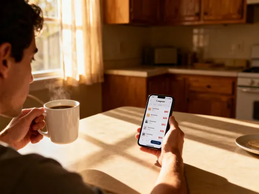
So I designed a simple visual dashboard. It was just a small square image I kept on my phone’s home screen, made with a free design tool. It had three icons: a stomach (for hunger), a face (for mood), and a battery (for energy). Each had three levels: low, medium, high. Before I reached for a snack, I’d tap the image and take ten seconds to ask: Where am I on each scale? If my hunger was low but my stress was high, I’d see it instantly. That small visual cue didn’t stop me from eating—but it made me pause. And in that pause, I could choose differently.
Sometimes I’d still have the snack. But more often, I’d pour a glass of water, take a short walk, or sit quietly for five minutes. The dashboard didn’t judge me. It didn’t track calories or shame me for cravings. It simply helped me become more aware. Over time, I started recognizing patterns. I noticed I craved sweets after long video calls. I reached for chips when I was overwhelmed. Just seeing those patterns—visually, without words—helped me respond with kindness instead of guilt.
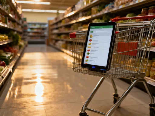
I also created a simple "snack menu"—a colorful chart with healthy options I actually enjoyed: apple slices with almond butter, Greek yogurt with berries, a small handful of nuts. I printed it and stuck it inside the pantry door. When I opened it, I saw choices, not chaos. The design made the good options feel inviting. And because I had a say in what went on the list, I actually followed it. This wasn’t about restriction. It was about creating a system that supported me, not one that fought against my habits.
Designing Family Meals That Everyone Actually Enjoys
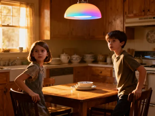
Dinner used to be a battlefield. My daughter would push food around her plate. My son would ask, "Is there anything else?" before even tasting it. My partner would suggest takeout as a peace offering. We weren’t fighting over politics or chores—just over what was for dinner. The stress wasn’t just about food. It was about feeling heard. Everyone wanted a say, but no one had a way to express it—until I created a shared family meal board.
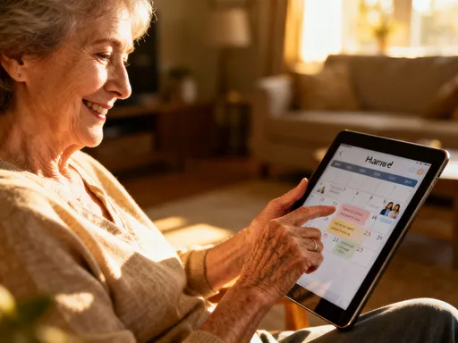
I set up a simple online board that everyone could access from their devices. It had spaces for each day of the week, and instead of filling it myself, I invited each family member to add their ideas. I gave them freedom: they could type, draw, or add emojis. My daughter started drawing little smiling carrots and hearts around "pasta night." My son used fire emojis for "spicy chicken." My partner added a taco emoji with a star. It felt fun, not forced. And because they had a voice, they felt invested.
The board became a living document. We’d review it together on Sundays, laughing at the doodles, negotiating gently (“You can have tacos Friday, but only if you try the roasted broccoli Wednesday”). I’d take the ideas and turn them into a real plan, making sure it balanced nutrition, time, and preferences. But the power wasn’t in the plan—it was in the process. The board gave everyone a chance to be seen. And when dinner finally arrived, there was less resistance. My daughter would point to her drawing and say, "That’s what I wanted!" My son would eat the broccoli because he’d agreed to the deal. We weren’t just eating better. We were connecting.
Waste dropped dramatically. No more buying ingredients that got ignored. No more cooking three different meals. And the best part? Dinner felt lighter, more joyful. It wasn’t perfect every night. But it was ours. The board didn’t solve every parenting challenge, but it gave us a small, shared win—a reminder that even in the chaos of family life, we could create something together.
Small Tools, Big Shifts: The Hidden Power of Personalization
For a while, I tried using pre-made templates—downloadable PDFs, app-generated planners, even Pinterest-perfect grids. But they never stuck. They felt too generic, too rigid. They didn’t fit my rhythm, my tastes, or my family’s quirks. What finally worked was building my own tools. Not because I’m a designer, but because I knew what I needed.
I started simple. A blank grid for the week, but with extra space for notes. I added a "comfort food" slot—because sometimes, after a hard day, I needed mac and cheese, and that was okay. I created a snack wheel—a colorful circle divided into slices, each with a healthy option. When I wasn’t sure what to eat, I’d spin it on my tablet like a game. It made choosing fun instead of stressful. I even designed a "leftover remix" spinner, with ideas like "turn roasted veggies into a frittata" or "blend soup into a sauce." Wasting food used to make me guilty. Now, it felt like a creative challenge.
Personalization made all the difference. These tools weren’t perfect. They evolved. I’d tweak them weekly—adding a "quick rescue meal" corner for busy nights, or a "try something new" slot to keep us from falling into a rut. The flexibility kept me engaged. I wasn’t following a system. I was shaping one that fit my life.
And that’s the quiet power of technology when it’s used well. It doesn’t have to be flashy or complex. It just has to adapt. These tools didn’t control me. I controlled them. I used them when I needed them, ignored them when I didn’t. They were there not to optimize me, but to support me. And because they felt like mine, I actually used them.
Beyond the Kitchen: How Design Thinking Improved My Daily Rhythm
Once I saw how much a simple visual tool could change my eating habits, I started wondering: what else could this help with? I applied the same mindset to other parts of my day. I created a color-coded water tracker—just a row of cups on a digital board, filled in as I drank. Blue for water, gray for coffee, yellow for tea. I didn’t set a goal. I just made it easy to see. And seeing it—really seeing it—made me drink more. Not because I was forcing myself, but because the visual reminded me gently.
I designed a simple "energy map" of my day. I drew a timeline from 7 a.m. to 9 p.m. and shaded the dips—mid-morning, mid-afternoon—where I usually felt sluggish. Then I matched meals and snacks to those times. A protein-rich breakfast to smooth the morning dip. A small handful of nuts at 3 p.m. to avoid the sugar crash. The map didn’t demand change. It just made patterns visible. And once I could see them, I could work with them, not against them.
I even applied this to my morning routine. I made a visual checklist—icons for shower, dress, breakfast, pack lunches, review the day. No words, just images. It helped me move through the chaos without forgetting anything. My kids started using a version too, with pictures of shoes, backpacks, and toothbrushes. The house felt calmer. Not because we were doing more, but because we were doing it with more intention.
The kitchen breakthrough had rippled outward. What started as a way to eat better became a way to live better. Design thinking—simple, visual, flexible—gave me back a sense of control without adding pressure. It wasn’t about being productive. It was about being present.
The Quiet Revolution: When Tech Serves Your Well-Being Without Taking Over
This journey wasn’t about chasing perfection. It wasn’t about logging every bite or hitting step goals. It was about using simple, creative tools to support the life I wanted to live—one that feels calm, connected, and in tune with my body. The most powerful part? These tools don’t demand attention. They don’t buzz, pop up, or send reminders. They sit quietly in the background, ready when I need them.
Technology, at its best, shouldn’t shout. It should whisper. It should say, "I’ve got you," without taking over. That’s what these design tools do. They don’t replace intuition. They enhance it. They don’t add stress. They reduce it. And they don’t require hours of setup. Just a few minutes of playful creation each week.
I still have busy days. I still eat takeout sometimes. But now, I do it with awareness, not guilt. I know what helps me feel my best, and I have tools that make it easier to choose that—without effort, without struggle. That’s the quiet revolution. Not a dramatic overhaul, but a series of small, sustainable shifts that add up to real change.
If you’re feeling stuck with your eating habits, I’m not suggesting you download another app or follow a strict plan. Try something softer. Open a blank canvas. Play with colors, icons, and words. Ask yourself: How do I want to feel? What would make this easier? Let your creativity lead. You don’t need to be a designer. You just need to care about your well-being. And sometimes, the simplest tools—the ones that feel like joy, not work—are the ones that change everything.